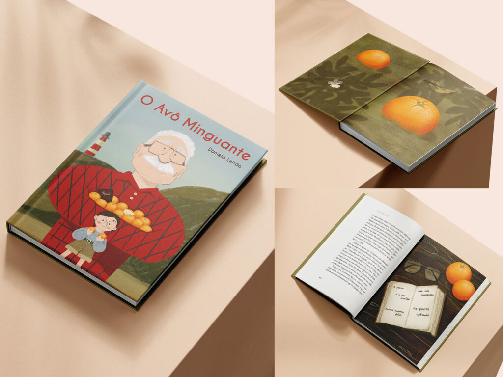
O Avô Minguante
O Avô Minguante was my submission for the 9th edition of the Prémio de Literatura Infantil Pingo Doce, a contest that brings together emerging writers and illustrators to create children’s books. The story explored the tender relationship between a boy and his grandfather, who seems to shrink as the boy grows up. In my illustrations, I played with scale and proportion to reflect this shift, while weaving in symbolic elements like oranges and his poetry books. Though it wasn’t selected, it was a deeply rewarding project that challenged me to tell a story through imagery with emotion and subtlety.
Libretto Design
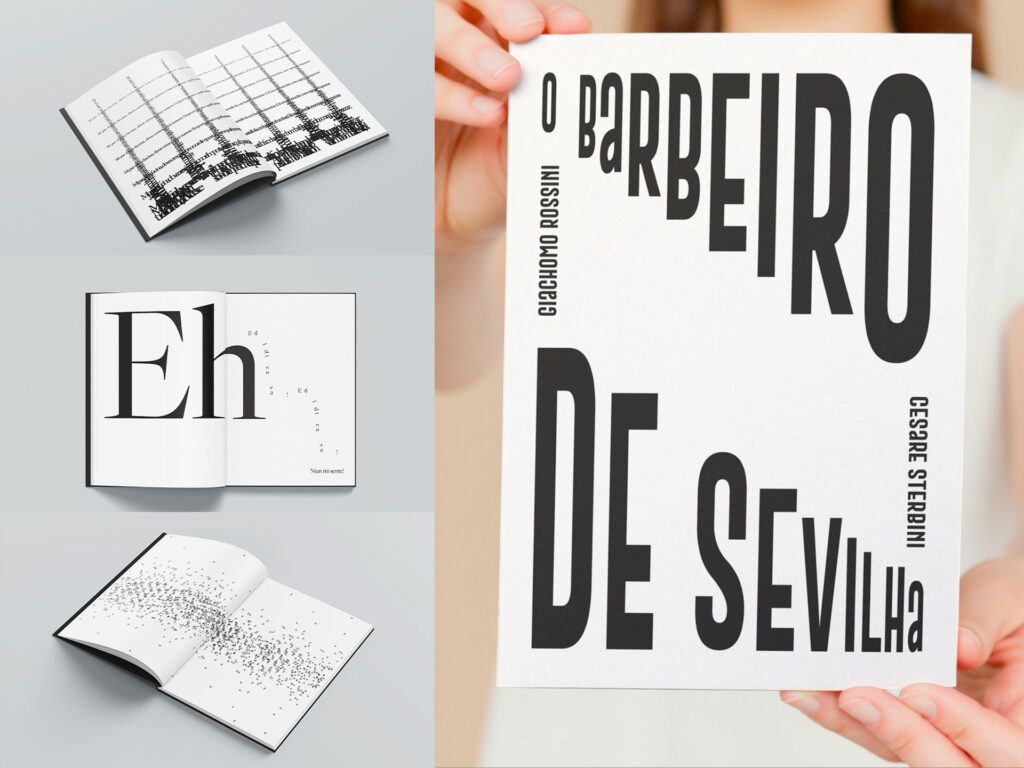
For this libretto design of The Barber of Seville, I explored the expressive power of typography as a visual and emotional tool. Instead of focusing on traditional readability, I aimed to reflect the rhythm, tone, and feeling of the music through playful, dynamic type treatments. The goal was to let the audience feel what is being sung, capturing the essence of the opera visually, rather than simply transcribing the lyrics.
T&G Magazine
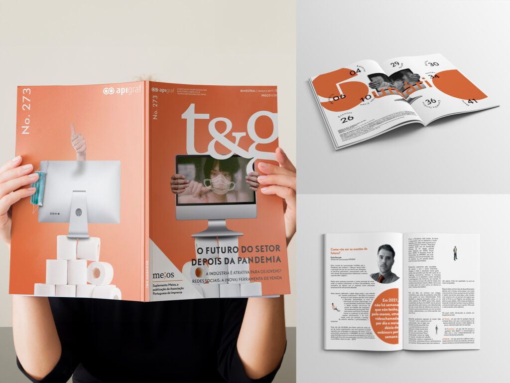
For issue 273 of T&G Magazine, I designed a concept for the cover, summary, and an article spread centered on the pandemic’s impact on the printing industry. Created in 2020, the design reflected the times with visual references to masks, toilet paper, and digital tools, symbolizing the sudden shift to online commerce and communication. In the article layout, I used text bubbles and fluid shapes to evoke the idea of personal safety space. Although this version wasn’t ultimately selected, it was a finalist in the selection process and a meaningful project that captured a defining moment.
"A Perfeição"
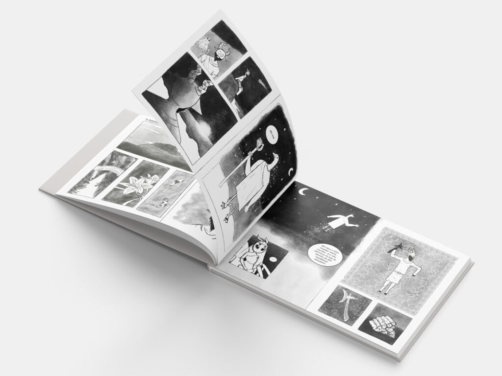
This project was a graphic novel reinterpretation of A Perfeição by Eça de Queirós, where I was challenged to reimagine the story visually and narratively. In my version, the characters were turned into animals that embodied their personalities: Ulysses became a stubborn goat, Calypso a cunning spider, and Hermes the messenger a loud goose. The transformation added a playful yet symbolic layer to the tale, allowing me to explore the narrative through a fresh and expressive lens.
Find Your Tune Zine
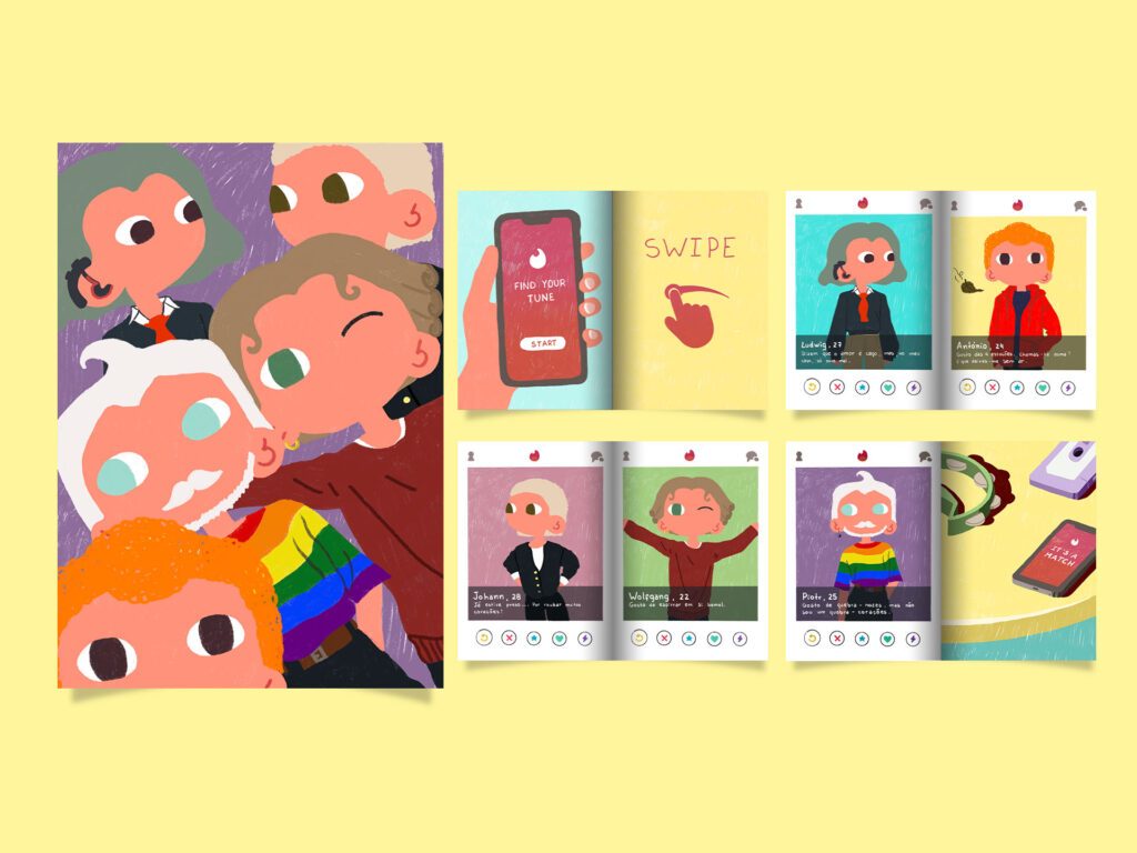
This 8-page zine was a playful take on classical music history, where I imagined what the dating app profiles of iconic composers like Beethoven, Vivaldi, Bach, Mozart, and Tchaikovsky might look like today. The goal was to bring these legendary figures into the modern world with a humorous twist—blending illustration, wit, and a touch of irreverenceto make them feel more relatable and human. A fun and creative exercise in mixing past and present!
ESCS Journal 21/22
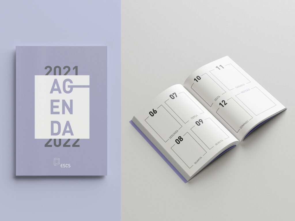
As part of a proposal for the 2021/2022 student journal of Escola Superior de Comunicação Social, our team designed a fresh, practical weekly layout that broke away from traditional formats. Each month was introduced by a different student club (núcleo), highlighting the school’s dynamic community life. One of the most distinctive features was the subtle reference to the school’s iconic architecture on the cover — a clever design detail only recognizable to those familiar with the building, offering a true “aha!” moment. Although not the final selection, our proposal was a finalist and one of the favourites, appreciated for its originality and thoughtful nods to the ESCS identity.
Traditional Style
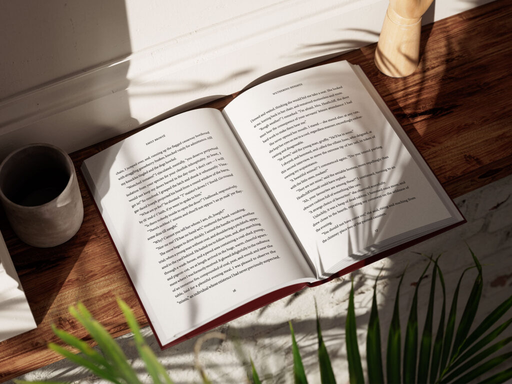
This project challenged me to design a traditional editorial layout for an edition of Wuthering Heights, following classic typesetting and pagination rules to the letter — including avoiding widows and orphans, respecting line breaks in quotations, and ensuring balanced, harmonious pages. It was a meticulous and detail-oriented process that demanded precision, but it also deepened my understanding of conventional editorial standards and the craftsmanship behind timeless book design.
